Last Updated: 29 Sep 2021 How the Tokyo 1964 Olympics Continues to Influence Modern Design
The trend of minimalism when it comes to graphic design and branding may seem like an invention of this millennium with the rise of the internet and instant global communications. But the origin of modern simple, wordless icons can be traced back to the 1964 Tokyo Olympic Games.
Ongoing in Japan House London is an exhibition, Tokyo 1964: Designing Tomorrow, exploring “The pioneering design strategy and lasting legacy of the historic Tokyo 1964 Olympic Games, the first to be held in Asia, which are often seen as a turning point for Japan.” The exhibition lasts until 7 November 2021 with free admission.
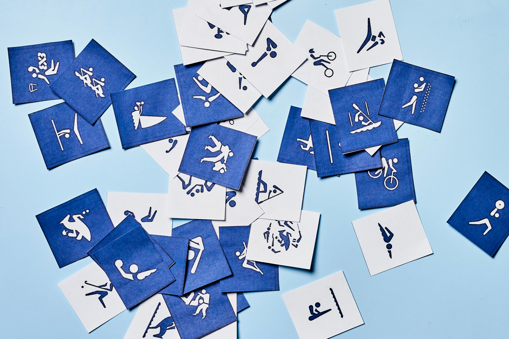
The exhibition covers aspects of the revolutionary design and branding that went into the posters, photography, and the minimalist logo designed by Kamekura Yusaku. But the most strikingly modern display was the pictograms used to represent the events and direct visitors.
The pictograms look straight out of a modern day graphic design textbook – the uniform, gender-neutral figures constructed out of geometric shapes communicate their meaning elegantly and wordlessly. Chances are if you were to go into a sports centre right now you would likely see similar pictograms also representing different sports, if not telling you the location of the fire exits or toilets.
The team behind the 1964 pictograms was headed by artistic director Masaru Katzumie and graphic designer Yoshiro Yamashita. Their goal behind these contemporary hieroglyphics was to create the beginnings of a global picture-based language designed specifically for sporting events.
Their development at the Tokyo Olympics makes sense for two reasons. Firstly, as this was the first non-Western hosted Olympics, the majority of the audience for the events and the host country staff would not be comfortable with signs in the Roman alphabet. Information signs written in multiple languages stacked on top of each other weren’t going to cut it for practical reasons. The amount of languages they would have to accommodate would make the signs too large and dense. Also, it still can’t be guaranteed that every person attending would be able to understand one of the languages on a sign.
Secondly, the Japanese kanji writing system, in turn based on the Chinese writing system, was itself a pictogram and ideogram based system. Kanji contain symbols within them that are pictograms which may resemble trees, or rivers or mountains, or that are ideograms conveying abstract ideas such as “word” or “spirit”.
And so, the pictograms were born. They were and still are figures made of basic geometric shapes positioned in a way to evoke an action or concept. There was a pictogram created for each event as well as ones created to mean general things like ‘first aid’ and ‘telephone’.
The pictograms were considered a success, as evidenced by all future Olympic events’ iconography being obviously inspired by them. The pictograms even made their way out of the Olympics and have been used in public places to mark information kiosks, disabled spots, toilets, etc.
Their influence and legacy has not gone unnoticed by the Olympic organisers. The figures were given a dazzling tribute in the opening ceremony to the 2021 Olympics. The sequence combined dancing, music, live theatrics, 2D and 3D animation, and amazing choreography from a team of skilled performers and artists. It’s really worth a watch.
The purpose of the sequence was of course to show off Japan’s past achievements by bringing to attention the influence they had on the field of graphic design. It even begins with showing how the original 1964 designs echoed through history to the Olympics that came after and how the designers used them as a starting point for their own similar pictograms.
While the 1964 Olympics were not the first to try to depict the events visually – the 1936 and 1948 Olympics also had uniformed icons for each sport – their designs have endured for almost 70 years. Even with our computers, high-tech graphics creation tools, and decades of study of design, the simple silhouetted figures have stayed.
For more on communicating visually, our classroom based Working Effectively with Japanese Colleagues course covers this and other communication tips, or you can try our online module Communication Style.
Related articles

29. Tinkle Tinkle Little Star【Column: Leap Before You Look】
Recently, I was at a storytelling event where I heard an 洞察力に富み興味深い (insightful and intriguing) stor

28. Book Club for Introverts【Column: Leap Before You Look】
When I saw an invitation from a colleague of mine, Jennifer Shinkai, to her special kind of book clu

27. Waiting for Goto【Column: Leap Before You Look】
It was at a take-out dim sum place in San Francisco Chinatown where I was struck with a realization